Target Users
Everyday commuters: Need clear, minimal interfaces for daily navigation and fuel tracking
EV enthusiasts: Prioritize efficiency, charging insights, and energy usage trends
Fleet operators: Require diagnostic summaries, maintenance indicators, and fuel/battery stats
Tech-savvy users: Seek interactive experiences, visual personalization, and integrations
Case Study
Project Overview
As the lead UI Designer, I was responsible for crafting an intuitive, adaptive, and data-rich dashboard interface that ensures safety, clarity, and engagement for drivers. The final product integrates core vehicle functionalities such as speed tracking, battery monitoring, and turn-by-turn navigation, all while providing theming flexibility and accessibility. Through deep research, wireframing, high-fidelity prototyping, and collaboration with engineering teams, the design system was built to be scalable, visually consistent, and compliant with accessibility standards.
My Role:
As a UI designer, I led the end-to-end design process—including concepting, prototyping, visual design, interaction design
Tools:
Adobe XD: For designing user flows, screen layouts, and interactive UI mockups.
Adobe Photoshop & Illustrator: For creating high-quality visual assets, icons, and graphics.
Figma
•
•
•
Problem Statement
Traditional vehicle dashboards offer limited interactivity and static data presentation, which often results in cognitive overload or missed insights during critical driving moments. Modern electric vehicles (EVs) and smart transport systems demand interfaces that go beyond basic functionality. Drivers need real-time contextual information that is digestible at a glance. Legacy dashboards also fail to accommodate personalization and adaptability across different driving conditions such as city driving, long-distance travel, and eco-mode commuting.
Problem Statement
Design an advanced, customizable, and user-friendly Human-Machine Interface (HMI) system for electric vehicles that:
Displays real-time vehicle status, driving metrics, and navigation
Enhances driver safety through visual prioritization and minimal distraction
Supports multiple UI themes (dark/light, high contrast, color-coded driving modes)
Offers intuitive interactions through touch, gestures, or voice inputs
Scales across different vehicle models and driving contexts
Color Psychology: Applied bold color cues to create immediate recognizability (e.g., red for danger, yellow for caution).
Radial Layout System: Centralized primary information (speed, range) surrounded by radial secondary metrics.
Minimal Distraction: Grouped actions logically and used visual weight to emphasize important data.
Typography: Sans-serif, bold fonts used with hierarchical sizing to ensure legibility under motion and light variability.
Motion Feedback: Smooth transitions for mode switching, animated gauge feedback, and entry-exit alerts.
Scalable System: Modular card-based UI design that can be reused and adapted across multiple screen sizes and resolutions.
UI Design Approach
Design System
To ensure visual and functional consistency across multiple screen configurations and driving modes, a robust design system was established:
Component Library: Includes reusable speedometers, battery indicators, map modules, and status widgets.
Color Tokens: Predefined color variables aligned with driving states (Eco, Sport, Night, Alert) and compliant with WCAG.
Typography Scale: 4-level hierarchy (H1-H4) paired with digital-friendly sans-serif fonts optimized for readability in motion.
Spacing System: 4/8/16px spacing rules for consistent layout alignment across modules.
Iconography Set: Custom icons for alerts, vehicle functions, and controls designed with simplicity and fast recognition in mind.
State Management: Visual states for normal, active, focus, and error conditions on all interactive components.
Theme Modes: Support for light/dark themes, including high contrast modes for accessibility.
Version Control: Managed in Figma with linked styles, components, and documentation for dev handoff.
The design system empowered the engineering team to scale the dashboard across various vehicle trims while reducing inconsistencies and redundant design cycles. It also enabled rapid prototyping and easier A/B testing of UI variants.
Outcome & Impact
Reflection
This HMI design project allowed me to merge storytelling with data-rich visualization. Designing for in-vehicle systems challenged me to consider attention span, motion readability, and safety first. I learned how to design for constrained environments while balancing aesthetics and utility. Collaborating with engineers, developers, and vehicle interface experts helped me refine both interaction and visual design systems. I walked away from this project with a deep appreciation for the nuances of embedded system UI and a passion for creating safer, more engaging driving experiences.
Learnings
Designing for Safety is Paramount: Unlike typical digital interfaces, automotive UI requires zero-friction interaction and minimal glance time. Designing with safety at the core changed how I prioritize content.
Glanceability vs. Information Density: I learned to balance rich vehicle data with visual simplicity to avoid driver distraction while delivering essential insights.
Cross-functional Collaboration: Working closely with engineers and vehicle UX teams taught me how to align design decisions with real-world implementation constraints.
Importance of Modularity: Building a flexible design system allowed me to support multiple screen sizes and vehicle types without redesigning from scratch.
WCAG and Accessibility: Creating accessible automotive interfaces expanded my approach to inclusive design—ensuring information was perceivable and operable by all drivers.
System Thinking: I developed a deeper appreciation for how every small UI detail—from icon color to button placement—impacts the entire driving experience.
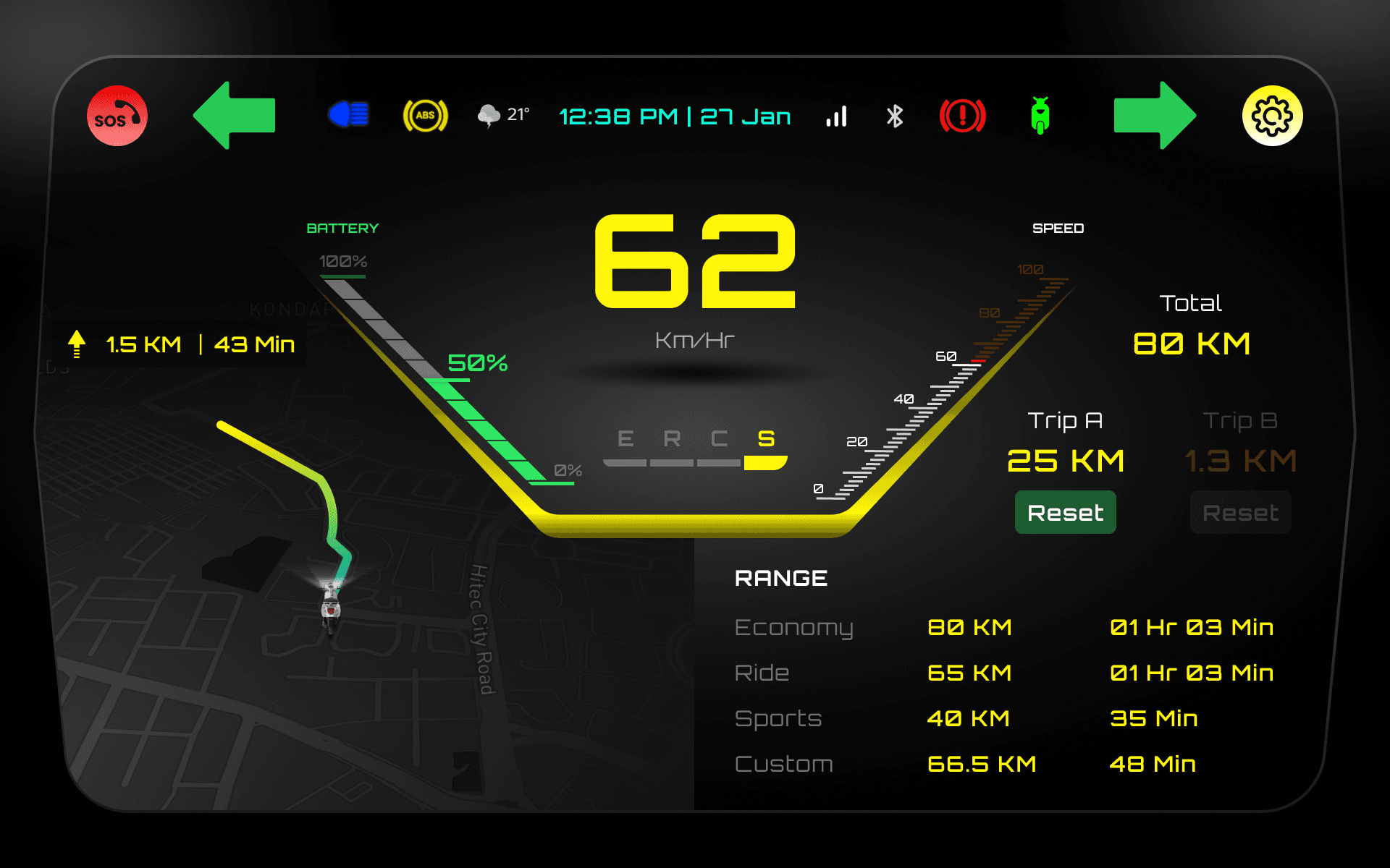
Visual Showcase
Screens included in the visual presentation:
Eco and Sport driving modes comparison
Night mode vs. day mode UI
Full diagnostic display with alerts
Battery and range-focused driving state
Map integration with live traffic overlays
Secondary functions such as music, call, and assistant

